Finding A Perfect Color Palette To Knit Your Sweater
For the longest time, Kodiak, Alaska has been getting rain—day upon day upon day. When you look outside the grey of the clouds meets the blue-gray of the ocean, and sometimes the soft interruption of the green Sitka spruce trees peek through the white fog. For outdoor activities, it isn’t the most wonderful view.
For color inspiration, it is a masterclass.
If you are anything like me, choosing new color palettes for knitting is often overlooked, or perhaps I should admit it is intentionally set aside. Placed on a back burner. Not necessary. I mean, I’ve got my color safety net, why mess up a good thing? It took me so long to conjure up the palette I have, considering a new one seems laborious and even a little premature. Surely I haven’t exhausted all the ways to use light brown, golden brown, reddish brown, and deep dark chocolate brown!
To be candid about color, I have experienced many moments in life where I have not felt confident mixing up colors, and that used to carry over into my knitting.
I had a breakthrough many years ago while living on Kauai. And it all started by staring out my window!
Today I am going to share a few lessons I learned, and continue to learn, each time I open my eyes to nature’s examples. Together let’s delve into the world of nature and explore how, as a knitter, we can find inspiration and confidently mix color combinations.
So, grab your knitting needles, cozy up, and let's discover the beauty of nature's hues!

Embracing the Beauty of Natural Color Palettes
When it comes to color inspiration, nature is an unparalleled artist, and she doesn’t mind at all if we try to emulate her artistry.
The blooming flowers and plants around us offer a spectrum of colors waiting to be translated into knitting projects. Trust me on this! I cast on the Alpine Bloom Tee with colors inspired by a neighbor’s not-quite-yet-blooming rhododendron. When I shared the start of my project I had hundreds of messages, some happily surprised at the use of pink, which is not my norm, and many others shared their color ideas. (One of the Reels I made showcasing the colorwork yoke had over 4500 views overnight, not because I invented an amazing color combination. Simply because I followed the example in nature, and the discussions in my DMs around colorwork choices resonated with knitting friends!)
Finding examples is easy. They are everywhere! Start by observing the colors found in your own garden or local parks—flowers, leaves, and landscapes hold endless possibilities for vibrant color combinations that will bring your knitting projects to life.
Seasons as Our Color Muse
Each season brings its own unique color palette.
Spring offers delicate pastels, while summer boasts vibrant and bold hues. Autumn showers us with warm oranges, yellows, and browns, and winter embraces cool blues and whites. Seasonal color inspiration offers us opportunities to try new things. It refreshes the example it shows. For me the tricky part was how to incorporate these palettes into knitting projects, creating pieces that weren’t a jumble of all the colors I saw. I wanted them instead to become snapshots of what spoke to me as I looked out the window, or paused on a walk.
I had to ask: “What was it that captures the essence of the seasons?”
Full disclosure here: I AM NOT SKILLED AT COLOR COMBOS.
I do, however, spend a lot of time outside— year-round, in the sun or showers. I am always looking around me, quite often to ensure there are no signs of bears, and also admiring the incredible landscape. When I look around there is always an overarching color I notice. The seasons definitely aid in showcasing one color! As I look in summer, our island is green. It is everywhere, and thick! Kodiak is called The Emerald Isle of the US for good reason. In Autumn things turn golden brown, not a sad withered brown, but a vibrant, energetic gold brown that gently eases into wintery white. The snow that gives us Termination Dust on the mountains can be blue-white or sparkling white, and other times a faded white that looks icy and black, a warning of bad weather advising all of us to hunker down and stay put.
Watching the world around me gave me my first step:
Start with a Dominant Color
Choose one color that will be the focal point or dominant hue in your colorwork. This color will appear more prominently in your knitting design and can set the tone for the rest of the color combination. For me, in the example of the Alpine Bloom Tee, that color is the rich green with brown undertones (Miss La Motte Burnished Stone Colorway).

After I established my primary color, I looked again at what I saw around me. In this case my neighbor’s rhododendron. Their established rhoddy started blooming already, and the faint pink with red burst had edges tinged in yellow-gold like rhododendrons do when they have gotten a little too wet. Since Kodiak Island is breaking records right now for the wettest seasons in recorded history, that isn’t surprising…) The green brown of the main color is what I see in the evening when the leaves and the branches are soaked. And the Burnt Sugar color (also from Miss La Motte) I am using for the second color reflects the pinky peach with brown undertones on the same bush. It is a perfect feature of their garden, and makes sense that replicating it in my sweater would work so well!
Neutral colors like grays, browns, olives, or creams can help balance and tone down vibrant or contrasting colors. They can act as grounding elements or provide a smooth transition between bolder color choices. So my “bold” color choice of the Burnt Sugar is mellowed by the brown-green of the Burnished Stone. I would have had a completely different feel if I had gone with my blooming fuschia and replaced the Burnished Stone with Watermelon Electrique in its vibrant red hues.
Before I began the adventure with this sweater with the yarn choices I currently have on my needles, I started with a vibrant solid teal and a fun barber-poled handspun I created that I have been eager to use. These two colors were put together from the most adorable poncho I saw on a model for a campsite in South America. It was a sunny picture and I was daydreaming of anywhere it wasn’t raining… which leads me to another point:
Draw inspiration from photographs, paintings, or color palettes found in magazines or online platforms like Pinterest (which was the source for the enticing camping photo I just mentioned…). This method could help you establish a starting point for your color choices. But after you get that inspiration there is a step I HIGHLY RECOMMEND…
You Should Test Color Combinations!
(ask me how I know…)
Hold on, before diving headfirst into your project, let's talk about the importance of doing a test swatch for colorwork. By taking this extra step, you can determine the color suitability of your chosen yarns, avoiding potential pitfalls later on. Before committing to your final color choices, creating color swatches or small samples to see how the colors interact is such a wise investment of time and energy. This simple step allows you to evaluate how the colors blend, contrast, or compete with one another.
A key benefit of doing a test swatch for colorwork is that it allows you to see how your chosen colors interact and work together before embarking on your full-scale project. Colors can behave differently when combined, and what looks harmonious on a yarn label or in a store display, or even on your lap in your living room a few days ago, may translate differently in your actual knitting. I wasn’t kidding when I said “Ask me how I know this helps…”
By creating a small swatch using the colors you've chosen, you can evaluate their compatibility, ensuring they blend seamlessly or create the desired contrast. This way, you can make any necessary adjustments or even reconsider your color choices if they don't produce the desired effect.
Neglecting to do a color swatch can lead to unwelcome surprises. Without a test swatch, you may find yourself well into your sweater project, only to discover that the colors you've chosen don't work as well together as you had hoped. Perhaps the contrast is too subtle, making the colorwork pattern difficult to discern, or maybe the colors clash, creating a chaotic or unappealing visual effect. This discovery can be disheartening and may require you to unravel hours of work or even start over with new colors. However, by taking the time to create a test swatch, you can address these potential issues early on and save yourself from frustration down the road.
Those 2 yarns I mention earlier?
I knew they were a perfect match, and so I was certain I could just cast on and go.
When I hit Round 27 I finally had to admit that no matter which way I held my knitting it just did not look good… And I’m the girl who always says to swatch. 9 times out of 10, I swatch. The one time I don’t…well, I wound up having to rip it all out!
Beyond color suitability and gauge considerations, a test swatch for colorwork provides an opportunity for exploration and creativity. It allows you to experiment with different color combinations and see firsthand how they interact. You can play with the dominance of colors, test various pattern motifs, or even try out alternative yarn options to achieve the desired effect. That is exactly how I came to realize what a great fit the single-ply Miss La Motte yarn would be! Through swatching, you can release your imagination and discover unexpected color harmonies or delightful contrasts, as well as dynamic changes yarn structure gives. This process of trial and error, done on a small scale, empowers you and me to make informed choices and infuses our colorwork projects with a touch of personal flair. Not just colorwork, but all knitting adventures!
Mskiknits Alpine Bloom Tee project by Boyland Knits shown on location in Kodiak, Alaska knit in Miss La Motte yarns
By investing the time and effort to create a color swatch, we open the door to endless possibilities and ensure our projects truly reflect our unique styles and artistic expression.
NOW BACK TO OUR COLOR PALETTE DISCUSSION
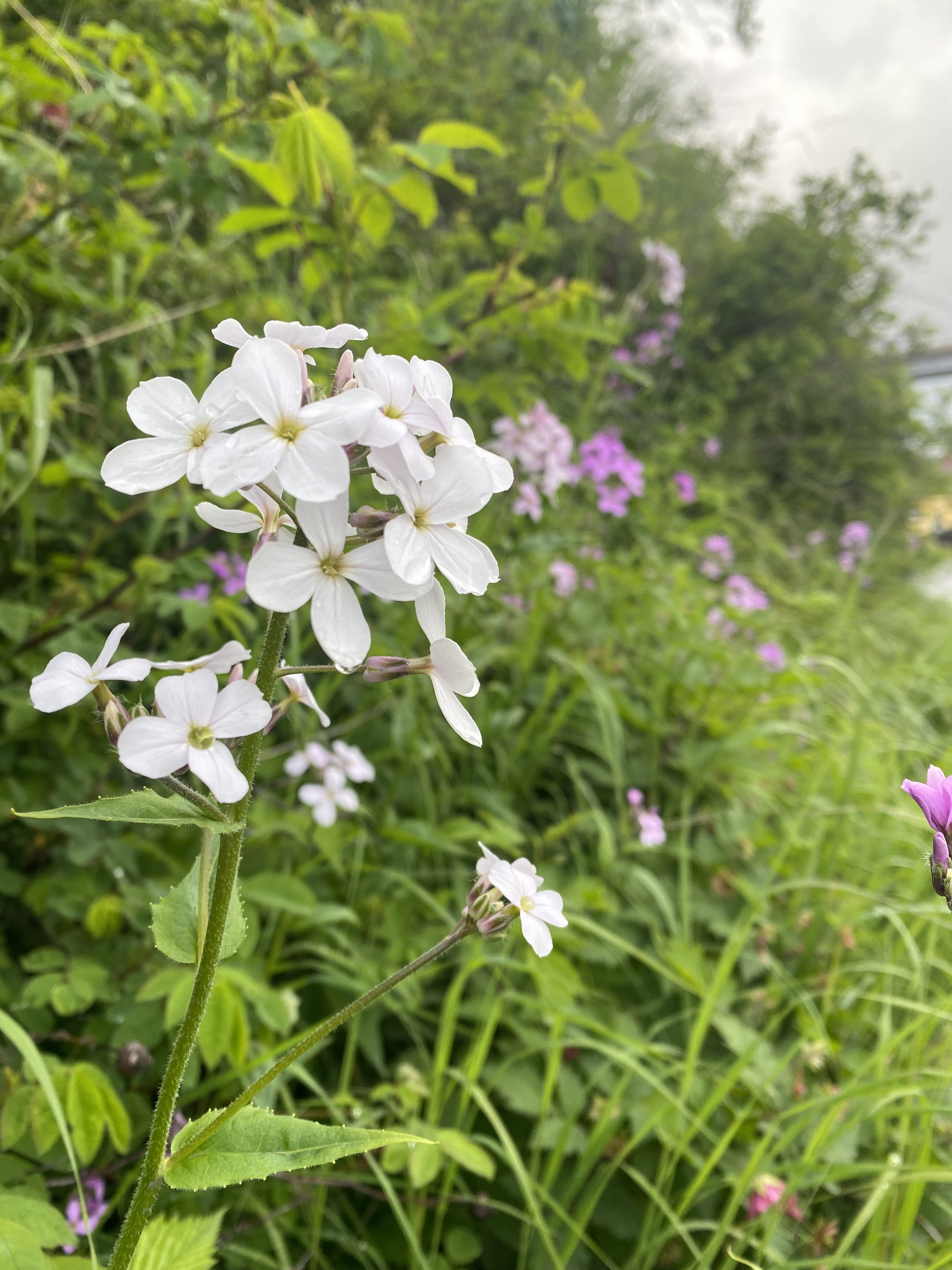
We discussed embracing the beauty of color palettes found in nature, using the changing seasons as our color muse, and I briefly mentioned earlier flowers. Let me dig in just a bit more into that concept. If I had taken the fuschia route I mentioned earlier, my Alpine Blooms Tee would have been reds and pinks with a completely different vibe than the one currently on my needles. What an example flowers can be! You can look to the blossoming flowers in your garden or local parks for a burst of inspiration. Plan ahead for times flowers aren’t blooming and take lots of photos now! Tuck them into a folder to keep your knitting inspiration organized. (You don’t do that? Well then, THAT is definitely a class I need to teach!) Be open to exploring the striking combinations found in nature: vibrant reds and purples contrasting with soft pinks and greens, electric blues with pops of yellows, and white flower petals with bold black centers. There are so many flower color combinations that you can translate into your knitting projects, infusing them with the beauty of nature.
Here are 3 quick examples from gardens I’ve grown:
ROSES: The classic combination of red roses with lush green leaves can inspire a project featuring deep reds and vibrant greens
SUNFLOWERS: The golden yellow petals of sunflowers paired with rich brown centers can spark ideas for a warm and sunny color palette.
IRISES: The delicate petals of irises, ranging from deep purple to soft blue, can guide you in creating a calming and cool-toned knitting project.

Up to this point, I have shared ways to observe colors in nature and replicate them. It is a practice that for years was all I understood. And because my kids are creative and clever, all interested in art as they grew up, they began to explore the color wheel and color theory. I should mention now that as a homeschooling family, I was their teacher, and when I didn’t know the answer to questions they asked, we dug in together and learned. At the age of “past 30,” I found the lessons incredible!
Unlocking the Magic of the Color Wheel
The color wheel is a powerful tool that seems at once simple, and somehow daunting. It has the power to guide you in selecting harmonious and visually appealing color combinations. It’s based on the three primary colors—red, yellow, and blue—and the relationships they share with each other, as well as with a variety of other colors. Understanding the basic principles of the color wheel can help you confidently mix colors. I have to tell you I have a series of color wheel prints, and art, that look at frequently. I understand it when I see it, and when I am not looking at it, I am flying blind!
Let's explore its key components together in a very basic way:
PRIMARY COLORS: Red, yellow, and blue are the building blocks of the color wheel. They cannot be created by mixing other colors.
SECONDARY COLORS: These are created by combining equal parts of two primary colors. The secondary colors are orange (red + yellow), green (yellow + blue), and violet (blue + red).
TERTIARY COLORS: These colors are formed by mixing a primary color with a neighboring secondary color. Examples include yellow-orange, blue-green, and red-violet.
Complementary colors are opposite each other on the color wheel, creating a vibrant and eye-catching contrast. In nature, we find examples of complementary color combinations, such as purple flowers paired with yellow-green foliage or orange blossoms set against blue skies. Nature is filled with examples!
Analogous colors are adjacent to each other on the color wheel, creating harmony— a cohesive effect. We can find plants with analogous color schemes, such as a variety of blues and greens in a coastal landscape, reminding me of evenings along the Outer Banks of North Carolina, or a variety of warm yellows, oranges, and reds in a sunset-inspired flower bed as I experienced for years living in Hawaii.
A monochromatic color scheme involves using different shades, tints, and tones of a single color. In nature, you might find a monochromatic color palette in a field of blooming lavender, showcasing various shades of purple. Or something I like to daydream about, a field of flax with beautiful blue flowers, some very bold and vibrant, just opened and blooming. Other flowers slowly bleached by the sun, and gently fading into a blue-white. (Speaking of flax, if you want a masterclass on linen and how learning about plant fibers makes us smarter wool knitters, have a listen to this episode: Unraveling the Mysteries of Linen: A Journey into Knitting and Creativity. There is even a FREE 20-page workbook for you to download to enrich the episode as you listen!)
Nature is an endless source of inspiration when it comes to color combinations for our knitting.
By understanding the principles of the color wheel and observing the harmonious blends found in plants and flowers, we can confidently mix colors and create stunning knitting projects. I am not saying we will always pick perfect palettes for projects (Whew! Say that 3 times fast!), I mean my color choices before the one I am currently using…well it was no bueno. But it was a fun lesson to learn the hard way. I needed to pay attention to contrast and prevent color muddling, AND I NEEDED TO SWATCH. But for the most part, these concepts, principles, and examples are solid and give me much-needed support. I have guide rails for this roller coaster of a ride that is my knitting. And now you do, too!
So, step outside, immerse yourself in the natural world, and let your knitting journey become a harmonious blend of colors inspired by our lovely planet. Happy knitting!